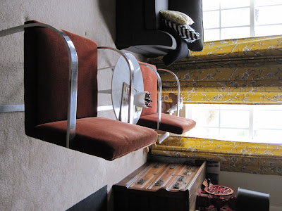
When I can't sleep I mull over what to paint or how to redecorate with zero budget. The other night I was lamenting the seating situation in my family room far into the wee hours. The furniture arrangement in my formal living room has been bugging me for a year now too. I desperately wanted the Brno chairs to be a part of that room but the room has a traffic flow problem due to the layout and relatively small size. The scale of the chairs just wasn't working but the fact that I paid a crapload of money for them made me insist.
 |
| Living room at my house |
 |
| Living room with Brno chairs |
We have a long, narrow family room with three walls because it is open to the kitchen. One wall has four windows. Another the fireplace and the third a staircase.
 |
| family room in 2011 |
This photo gives you a basic idea. The sofa is too long to put perpendicular to its present location. In the foreground you can see the edge of the shelf that houses my little one's toys and I wanted to leave that area free of furniture for play.She really doesn't play there so I did this...
and thought to myself, "Kerry, you idiot! Why didn't you do this a year ago?"
It feels so much better like this but this is just a trial period. My husband will probably hate it.
Here you can see the toy shelf behind the brown chair. There is plenty of room without squeezing for even an adult to get back there.
This looks so much better. Yes?
The coffee table is also temporary. It is nearly indestructible and I don't give a hoot about what happens to it. Here are a couple more shots from around the room.
It feels so much more balanced and still has that eclectic and collected (because it was) look. Now if I can convince the little girl that lives next door that the Brnos are not rocking chairs. *sigh*


11 comments:
A great solution for the Brnos! LOVE them in the FR. Lately I have been considering moving some pieces around my house too, you have inspired me, though I'd better get some work done before I tear up my house!!!!
I love this new arrangement. The two chairs (vs the previous stuffed chair) even give you more of a view of the fireplace. Love it.
IT WORKS! It's fab! My mind works the same way. I will come up with something, so obvious, and wonder why it took forever to realize it! You know me and I am moving chairs, lamps, tables, you name it, from room to room. It's amazing what a difference it can make.
The chairs are perfect there, perfect! Always try something new and different! It can always go back and the exercise does wonders!
looks GREAT!
I think you made it work! The room is so much more balanced. Love the window wall and drapes, and always love your art. Good job!
Love it Kerry! Why don't you put big ol' casters on that end table and paint it, or stencil a pattern on the top? I know those chairs are LR worthy, but you deserve every room to look upscale and those chairs do it! wow, looks great!!!!!!
xo Nancy
Powellbrowerhome.com
It looks great! I had to laugh about the little girl who lives next door rocking in your chairs...good luck with that! HAH :)
I like it. Be nice to yourself, sometimes it takes a late night inspiration to get the brain working again.
I so agree Kelly! Because the chairs are relatively "light" you can still see all the beautiful things behind it! Don't sweat on it, it happens to all of us, as they say "better late than never". Glad your happier now!
It's perfect! It looks very balanced and I love that you have a temporary coffee table that you don't care about. With children about that is smart!
It looks great....
Post a Comment