I hope you all have enjoyed this Virtual Show House series and all of my talented contributors. I was going to stay out of things but I thought the house needed a kitchen. A virtual family has got to eat!
I chose all white not because that is trendy but because it is timeless. My first kitchen design 18 years ago was for my first house and it was mostly white. I still want that kitchen but maybe a bit more upscale.
 |
| My inspiration |
The counters should be honed soapstone with chiseled edge to cut the formality. The flooring should echo the counters in color and feel.
My kitchen changed mid-idea and I made room for the barstools below
My kitchen changed mid-idea and I made room for the barstools below
Bar stools
The barstools are from 1stDibs and I chose the sleek mid-century design to keep it from being too traditional.
Over the arched stove niche I added art. I felt the room needed a little jolt of color and I usually opt for a fabric window covering to achieve that. The arched window over the sink is bare by choice, so the art is where the color comes in.
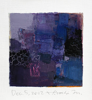
I chose three original paintings by Hiroshi Matsumoto.
The Etsy shop is HERE.
I chose the 4 x 4 inch abstracts beacause they are stunning and at $60 totally affordable.
The faucet I chose is a Waterworks Julia Bridge. It is not groundbreaking design just a lovely traditional touch that I am fond of.
I really wanted to mix metals so the chrome bar stools and faucets needed a foil. I found that in brass drawer pulls.
I chose long handles for the cabinets and integrated refrigerator.
Thanks for reading Day 6 of my Virtual Show House.
Here is a run down of the Days 1-5 in case you missed them.
The barstools are from 1stDibs and I chose the sleek mid-century design to keep it from being too traditional.
Over the arched stove niche I added art. I felt the room needed a little jolt of color and I usually opt for a fabric window covering to achieve that. The arched window over the sink is bare by choice, so the art is where the color comes in.
 |
| HERE |
The Etsy shop is HERE.
 |
| Here |
I chose the 4 x 4 inch abstracts beacause they are stunning and at $60 totally affordable.
 |
| Here |
The faucet I chose is a Waterworks Julia Bridge. It is not groundbreaking design just a lovely traditional touch that I am fond of.
I really wanted to mix metals so the chrome bar stools and faucets needed a foil. I found that in brass drawer pulls.
 |
| HERE |
Thanks for reading Day 6 of my Virtual Show House.
Here is a run down of the Days 1-5 in case you missed them.
Day 1 Entry by Loi Thai
Day 2 Living room by Beth Connolly
Day 3 Dining room by Lindsay Dress
Day 4 Master bedroom by Stefan Hurray
Day 5 Kids' rooms by Nancy Powell and Bethany Brower
I hope you will stop by on Monday to see some of my new fabric designs,


6 comments:
Kerry I totally love your kitchen plans. And thanks for introducing me to that fantastic artist! The knobs and handles are TDF!
Xo Nancy
Powellbrower.com
You and I have such similar taste. I love the hardware and stools, too. Soapstone has been on my love list forever. What is Nancy doing up at 5am? Fun virtual tour, and lots of ideas.
I love white kitchens and I want those stools!!! Great series.
Hi, Kerry -
It was so fun participating in your virtual showhouse! Many wonderful and stylish ideas and designs. Your kitchen design is fabulous....love the 3 paintings from Hiroshi Matsumoto!! And cool barstools....so chic!
Cheers,
Loi
Love a white kitchen. This is great!!
Hooray for white kitchens. I am nutso over the bar stools - such gorgeous brass lines - and of course, the art is phenomenal!
www.chattafabulous.blogspot.com
Post a Comment