Showing posts with label mantels. Show all posts

Thursday, February 20, 2014

Thoughts on displaying art


In looking at the many varied images that display art in ways that I find pleasing I began to notice my own favorites. I am talking about more than just hung on a wall versus tabletop or bookshelf display. I have been thinking about the particular details that make up the context for display of two-dimensional art.
I'll show you a few examples and share my personal tastes along the way.

In the first photo the art work is propped on a mantel and layered. It also is an asymmetrical  assemble of art and objects framed by a symmetrical collection of objects.
I find it quite pleasing but in my own home might feel as though something were missing in this over-mantle arrangement.


This layered asymmetrical art arrangement seems to ground the work on the wall above and the work above seems to call attention to the collection below.
This is, to me, is perfection.


I could be persuaded to prop a piece in front of a mirror as Miles Redd has done here.

 
Propping paintings on the floor is evocative of an artists studio and is a common site in my own house. A house full of rambunctious kids may not be ideal for this type of display but its awfully romantic in a bohemian kind of way.


The idea of grouping a piece of art with another collection based on color, era and other similarities is intriguing to me although I might choose differently than this example.


Gallery walls and salon style installations are big buzzwords these day but nothing new. I particularly enjoy them when there is a theme of sorts.
Figures, caricatures and portraits are my favorites to group as you will see in the next two examples from my house.

a corner of my dining room
My college aged son's room

The choice whether to display art collections vertically or horizontally is a matter of taste and context in the space.

The Pink Pagoda

 A horizontal installation can bring life to a wall that is too wide to hold one work with any impact. My favorites either way include more than two.


I love vertically hung pieces on a narrow wall.
I have my own hang-ups (pun intended) about displaying art. 
Do you have rules that you adhere to?
What is your favorite way to display art?

Wednesday, July 11, 2012

Mantel refresher

New understated look

Lately my mantel has been trying on new looks to cover the "hole" or TV niche that I find beyond tacky and totally useless.

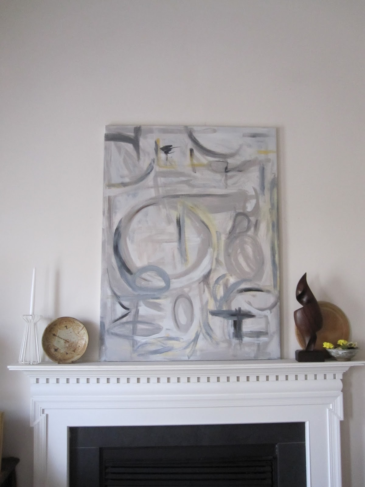
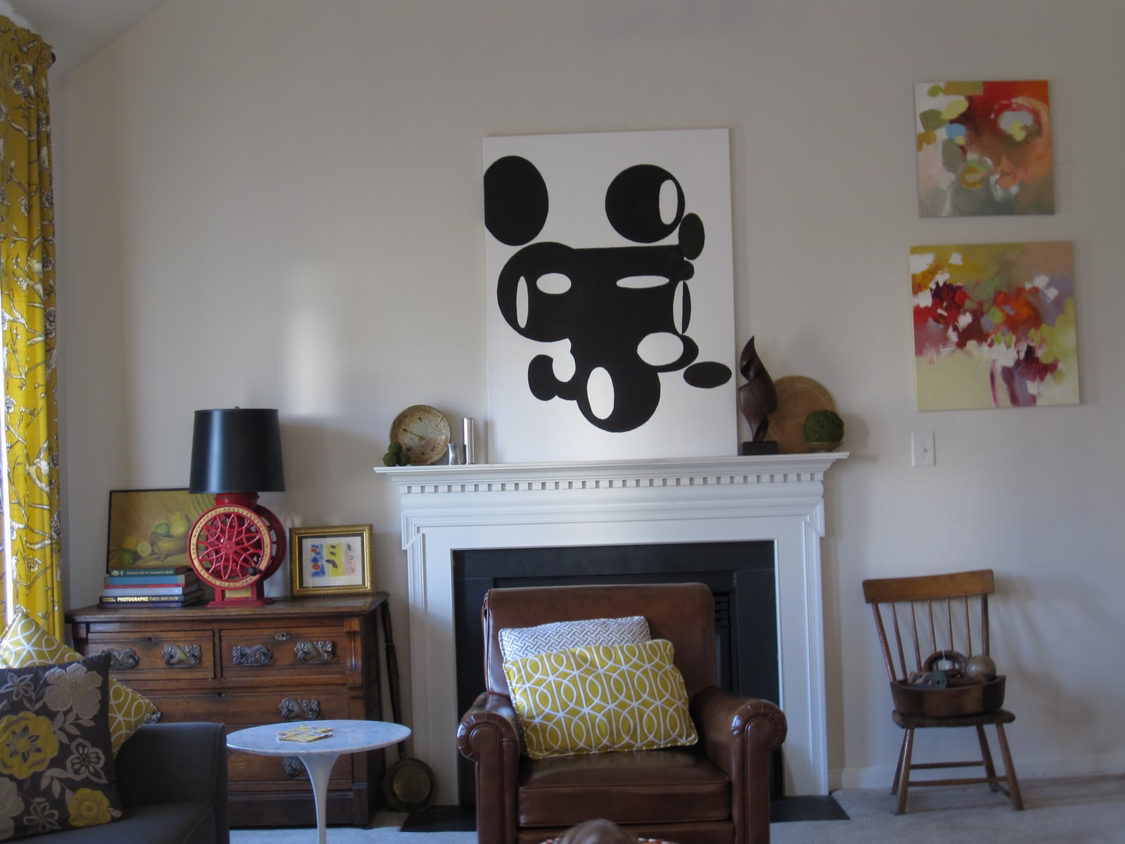
Mickey, you have been painted over
This painting was the first large painting I did for myself and is, admittedly,  pretty bad.
I heard things like its an elephant, Andre the giant, and Mickey Mouse. Mickey had to go.

I put this painting by Jenny at MFAMB in front of it for awhile.


To be honest all of the color was getting on my nerves. The room began to have juvenile, circus-ey feel. So out it went as soon as I needed a spot for this...

"Being There" by Kerry Steele
This painting just needs a spot until I sell it. My family loves it but it really did not work with the feel of my family room. So out IT went and I got to painting over Mickey.


The resulting look is so completely different than all of its predecessors that it makes me laugh but I am liking it for now.
 Speaking of mantels and my work, have you seen the painting I did for Jennifer of The Pink Pagoda?


She did a beautiful job of styling it in her gorgeous home.

Friday, January 13, 2012

Mantel revisited

Fall 2011

I have spent the last several days playing with my stupid mantel.
If you read this post you know about the hole and the challenges the mantel presents

September 2011
The comments left were helpful and my husband and I agree that the hole has to go, but not just yet.
It will have to wait until we paint and with 18 foot ceilings, I am in no hurry.

So please be kind while laughing looking at my trial vignettes.
I was inspired by a post of Michelle's on My Notting Hill
This overloaded mantel was love at first sight. I couldn't do exactly this because of the painting and the hole but I tried a mini version.
No, I don't think so

It was too dark and moody for the room which is a mix of modern and rustic pieces. As it is, I think there is too much wood and too much brown, so Ye Olde Curiosity Shop had to go.
 I tried colorful books but the result was laughable and cluttered in appearance.
Next came a few that did not even warrant photos.
Yesterday I found the swirly wood sculpture thingy and this morning remembered a few things that were packed away. So I tried the above arrangement. At some point there was a green beaker vase but I must have forgotten to snap a photo of that abomination.

Next came the sparse look.
This was better but really too sparse.

Adding another circular element helped by repeating the circular shapes in the painting and the adjacent lamp.

This is where it stands 13 January, 2012
**In the hour since I posted this I added one small tweak. Moss covered balls for an extra layer and texture.**


I really would have preferred more color but it was not to be had in my shopping trip yesterday, which was a four hour shopping trip with a two year old.
My other thoughts were to frame the painting and possibly paint or gold leaf the swirly sculpture thingy.
Fire away with your comments!

Wednesday, January 11, 2012

A most infuriating mantel


Fall 2011

 I spent this early morning scouring Pinterest for ideas for my mantel. It is a most infuriating spot.
It is only 6 1/2 inches deep but more annoying is the hole.
Painting covers "THE HOLE"
I have a large painting in front of this abomination. It was for the purpose of housing a TV. Yuk!
I can't just drywall over it because it houses the wireless internet connection for the house and several electrical outlets.
The whole mess makes it difficult to "dress".

So here is a taste of what I found on Pinterest.

I prefer symmetry in formal settings but my mantel is in a casual space.


I am drawn towards feminine collections and pretty things but that just wouldn't suit my space.


A collection of oddities seems more appropriate.
I had to include this
No guts, no glory. The mantel above gets my vote for most creative and I really love it.

Here are a few more.


I am open to suggestions.
I should also add that the ceiling above my goofy mantel is angled, 9 feet high on the left and 18 feet to the right.
Ugh.