Saturday, March 23, 2013

Weekend babble

Tulips in my entryhall

Its been a crazy week of "to dos" around here and there never seems to be enough hours in a day.
Not complaining, but Dang! its hard to find blog time. I have two posts in my head that I have not had a chance to put together.
I have been working on several commissioned paintings as well as one that continues to explore my "opposing forces... in harmony...paradox" theme. LOL! That is a goofy explanation but I am just babbling today.
I also spent a great deal of time investigating preschools for my little one. She taught herself to read (wasn't me) so it seems like a waste of time to send her into another year of a school that is teaching letters and colors. This adds up to major $ but I think I have made my decision.
We are also about to start creating a studio in my basement. There is a bit of natural light but it doesn't matter. I paint at night mostly anyways and I would just have to bring the work upstairs in the a.m. to check colors.
This is not a quick project. Shelves have to be built to organize stuff better and a sink and lighting needs to be installed. My husband has yet to have two days off in row this year so finding the time has been impossible. This is about to change, so I am excited to finally have dedicated studio space.

What have y'all been up to?

Tuesday, March 19, 2013

New fabric designs and input needed

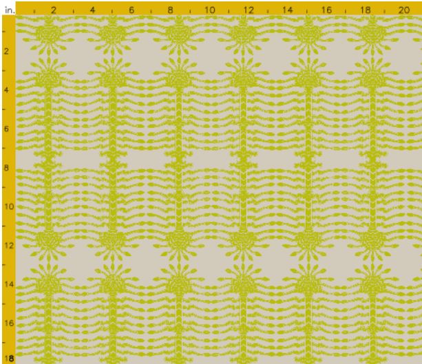
Meander blossom
I have been working on some new fabric designs on Spoonflower. Many of the designs I work on take hours of tweaking only to be abandoned in frustration. Others come together nicely like this one called" Meander blossom".


At this point there are only three colorways. I bought the large color map so that I could get the colors right from the start.


I would really like to know what color combinations you would like to see in any of my fabrics but especially these.

Sacred tree in asparagus

One thing about Spoonflower that I find annoying is the vast difference between the on screen colors and the actual printed colors. This example above is an asparagus  green on a beige-ish background but it looks like a sickly yellow on gray on my screen. I know what the colors are because I have the color map but someone browsing the site would think it awful.


Here is an example of the difference. It seems especially problematic with blues.

sacred tree in storm
I thought this "sacred tree" design lent itself to neutrals but I would love a few opinions on colors that you think would be great for any of my fabrics. Many are not yet for sale because it makes more sense to order the sample swatches all together, after I have sorted out the various colors. I have to proof the samples before Spoonflower will sell them.

So spill it... what other colors should I add?
Here are the designs that are public but not all are for sale.

Monday, March 18, 2013

Lamps that turn me on


Let's face it, Chris Spitzmiller lamps are the bomb-no?


In a pair they really help repeat a room's color story and I think they are darn cute.

I am all for top quality but there are times when a budget has to make trade-offs. The cool thing is that these table lamps that are every bit at darling as the Spitzmiller version are easy to get your hands on.

$59 HERE
$129 HERE


$169 HERE

This version from Shades of Light is a bit more spendy at $449 but the colors available are bananas.


HERE
Shades of light also has this version in seven colors that is about half the price.

$225 HERE

Friday, March 15, 2013

Grafitti living

source

I think the sofa above is really awesome and I would do it in a heartbeat if I thought I could pull it off in my house. I think it would look silly in a suburban, new construction house.


The owner of this furniture, Pamela Bell, one of the four original partners in the Kate Spade brand, bought muslin covered furniture from John Derian and asked her daughter's class to come and decorate it.
It take's "kid friendly" to another level.
How's that for being cool?
I f you could, would you?

Wednesday, March 13, 2013

More scrips and scraps

dreadful late night photo
I had fully intended to bail with one photo (that will follow) and call "working on Spoonflower designs".
I have been doing that, but I have more importantly been exploring a theme with my painting and I would like to talk about it a little.
I realize that abstract expressionism is old school, 75 years or so, but in terms of art, every genre is re-explored. Joan Mitchell reexamined the great impressionists like Monet and Van Gogh.
I like to think that even my tiny foray into art can meaningfully (to me) revisit the greats.
I was egged on by this snippet from Seth Godin's blog...
 You’ve already won (or you’ve already lost). Right now, you can choose to do what’s in your heart, you can bring your real work to the world, instead of a lesser version, a version you think the market wants. After all, what do you have to lose?

When it feels like it’s hopeless or when it appears to be a lock, why not?

So you bring your true self to the work, your unadulterated effort, without negative self-talk and the sanding off of the interesting edges. Instead of compromise, you bring us vision.
 
So for me that means who the #^*% cares just paint something and see if it sucks or not. 
This painting is the beginning of something I want to explore. I want pretty (feminine) and ugly (masculine/violent) to act in harmony, instead of two separate forces juxtaposed.


This one is a baby step in that direction. I think that this is one of my better canvases. I titled it "Library of laughs"

 I once wrote about my first husband, who is now dead, having a "library of laughs" because he had so many that you could have written a language around their various meanings. I am so thankful for the children we had together and this spirit that gives us smiles...still.
So there it is Matthew... my wave

 Happier...
I picked up 6 pink roses at my local Aldi grocery and they are perfuming several rooms with their intense fragrance.
I'll be going back for more of those $4 roses tomorrow!

Tuesday, March 12, 2013

This and that

Last week, I mentioned that I have reluctantly joined the smartphone world with my iphone.
The most interesting part so far, is the quality of the camera.

 On the left is the iphone picture and the right was taken with my camera both at the same time in fairly low light. I love that the iphone captures truer more vibrant color but...

in my living room with light coming towards me the iphone (on left) captured color better but the room looks quite dark. My camera just washes out everything.


On the left is the iphone photo and the muddy shot on the right is from my camera. These were taken at the same time in the same light. I know which I will be using to photograph all of my art from now on.
That painting is another, larger oil on canvas that I completed over the weekend called "Babylon". The goal was to either juxtapose or tread the balance line between happy/floral/feminine and dark/aggressive.
I most definitely erred on the side of happy/floral and it feels like a successful canvas to me even without as many dark and aggressive elements as I originally intended.

Jack in his Tibetan hill tribe hat at 9 months

Today is my son's 18th birthday.* sniff sniff * It will be his last birthday living at home and this is a bittersweet moment for me.
He almost always wants cheesecake as his birthday cake but this year request a brownie cake with chocolate ganache. There is no more budget friendly, simple yet decadent cake out there.
I start with two boxed brownie mixes and bake one each in a 9 inch round cake pan and let cool.
The icing or chocolate ganache couldn't be simpler.
  • 8 ounces semisweet chocolate, coarsely chopped
  • 1 cup heavy cream
Heat the cream over medium heat without boiling. Remove from heat and stir in chocolate until melted.. This will take several minutes and the ganache will thicken as it cools.

 This sometimes needs an extra few seconds over low heat to get smooth.
 Once the ganache has thickened somewhat, use it to frost the brownie cake layers.

 Be patient. Not like me, who always pours it too soon.


This is much more fun if you let a little girl lick the spatula and pot.

Monday, March 11, 2013

DIY done


 Earlier this year I teased you with a non-New Year's resolution but a January resolution. Well, it might be March but I am done.
I also did a post on block printing fabric that was part of this project. It involved furniture legs that I have had sitting around for 15 years! I sprayed them glossy black.


It started like this, with leftover plywood and $16 worth of foam.


I also had the cotton batting and four furniture legs.


The project involved simply upholstering the plywood and foam with my hand block printed fabric. Old hat, right?
Wrong!


The foam was really thick and the batting and fabric was really bunched up on the underside of the corners. This made it impossible to attach the legs. I almost gave up and threw the whole thing away. Instead I left it on my dining room table for a month and did this...

I cut away the bulk and left enough bare wood for the leg brackets to screw into.

I am I in love with it? Not really. I wish that the fabric was more muted, kind of like this Instagram photo.
It does serve as the (almost) no- money- spent -side -table for the other end of my family room sofa.


Its a little leggy but its done and so it stays for now even though there are about 50 tables I would rather have there.