Tuesday, October 28, 2014

Making monoprints in my studio

"Nettle" oil on paper monoprint

Sometimes an artist needs to regain that element of play in work and monotypes are the way I have been playing this week.
Many people see the word print and think it is a reproduction and sometimes that is the case, but with monoprints they are a one of a kind piece of art where printing is part of the creation process.
I am going to show the method I used.


First I bought an 18 x 24 sheet of plexi-glass from Lowe's.

I grabbed some blank newsprint, art paper ( I used Arches oil paper for my oil prints and watercolor paper for an acrylic print) a ruler, a marker and brayer.

I traced the paper I was using on the newsprint and also the marked out the smaller area I want to actually print.

 I traced it with pencil and then went over with marker so it would be really easy to see.


I started with oil color inside of the printing area and chose two pale colors for the first layer.


Once I was satisfied, I carefully lined up my paper with the outside marks I made on the newsprint and went over the paper with a brayer.


The first layer had really soft colors so I continued with a few brighter layers without cleaning the plexi-glass.


I used the same process of lining up the paper and rolling.

I worked from light to dark on this one but sometimes you might want to do the reverse.
It is also fun to erase each layer after printing and before adding the next layer.

Here are a few other I made over the weekend.
The first was made with a sheet of acetate that I turned over onto the paper and it should be noted that I wiped it clean between each layer.

"Kelp" oil on paper monoprint

"Prairie grass" acrylic on paper monoprint

Are you going to give this a whirl?

Friday, October 24, 2014

Interior doors-a before and after

I know y'all love a good before and after. This is a small one that is part of a major undertaking that we have begun before we sell our house.

I see a white door and I want to paint it black

Our interior doors are white...yawn. A few years ago, I suggested to Mr. Designdumonde that a budget friendly upgrade might involve painting all 27 of these doors black. He politely told me that he was not on board. Well, actually not politely.

doors to my studio

Fast forward to "return on investment time" and we are adding touches to make our house stand out.
It sort of reminds me of the time I wanted to paint my dated kitchen cabinets white and Mr. D said something like, "Are you crazy, woman! I am not painting all that!!!" Then when it was time to sell, he had this great idea to paint the cabinets. So go our adventures.
The walls in all of the entry, kitchen, family room and upstairs hall will be painted a pale gray because it is a partially open plan house.

My studio doors are now black.
2 down. 25 to go.

Tuesday, October 21, 2014

Art and interiors with a few GIFA artists

I took a cue from Jennifer at The Pink Pagoda's post last week, highlighting my paintings at Gregg Irby Fine Art with different chairs. I love creating design boards and thought it would be fun to make some for a few of my fellow artists at GIFA.

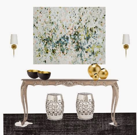
I started with Erin McIntosh. I am smitten with "Zoe", a 60 x 48 canvas that makes a statement. I paired it with mixed metals and a very long and feminine console table. The black rug and modern accessories give the vignette an edge.


Next I chose one from my friend, Christina Baker.

I chose "Eastern Blues" just because I love it so much. I paired it with classic furniture and Persian rug so that the painting takes center stage.


I went a different direction with the board for Michelle Armas. I chose funky mix to go with her piece "I believe this belongs to you", and dark walls. I do wish I had saved the draft on that one because I found a better chair later. I'll just have to do more of these next week!


Eileen Power has long been a favorite of mine and I thought the piece "51" would be great in a modern, uber-feminine and glam space.


I just chose 4 of the 25 artists at Gregg Irby today, but there is always time for more.
Who's work would you like to see in a styled room?

Friday, October 17, 2014

House tour by paint color

One of the first things I was dying to do to my house when we first moved in was paint the walls. It is relatively cheap and I was aching to cover the "Swiss Coffee" or builder beige walls.


My initial instinct was to choose the same colors from my previous house that I loved. Luckily, my husband procrastinated long enough for me to come to my senses. The light is far better in this house and we have some different furniture in the rooms.
Although it wasn't the first room I tackled my living room is just inside the front door.


I used Sherwin-Williams Faint Coral. It is a pale pink that leans slightly towards peach and is a little muddy.
It might be my favorite paint color in the house. It is understated and sophisticated, not the least bit sweet.

Connected to this formal living room is my formal dining room and I wanted a foil for the feminine room on the other side of the archway. A masculine, cigar box was the intended look.


We used S-W Rugged Brown in a gloss for the walls.


Upstairs I used a color that was most like the color of my previous bedroom but far better.


S-W Wondrous Blue is one of those chameleon colors that changes dramatically with the light. It is blue most of the time but the lavender and gray undertones sometimes become the main event.

My son's room was fair game after he left for college and the very first One Room Challenge  linking event was the impetus to get me going.


I knew I wanted a moody, masculine color and S-W Naval was an easy decision.


My youngest daughter's room has been a decision problem for me. One day I just could not stand it any longer and ran out for paint samples.

I ended up using Benjamin Moore's Key Pearl which is as pale as my living room pink but a much cleaner color. It is not overly sweet or overly pink, just a barely there color that lets other items do the talking.


Read more about how I chose the pink HERE.
Confession: we have a vast open plan on the remainder of our first floor that we have not painted in the more than 3 years we have been here. Now that we have decided to move, it is on the must do list but while I look at paint I can't help but fantasize about the colors for the next house.

Do you love or loath choosing paint colors?

Tuesday, October 7, 2014

A few new Chinoiserie fabrics


Several years ago I created the rather popular "Escher Pagoda" design on Spoonflower.com.
I have done several custom orders including matching paint colors and enlarging and rotating the fabric.


This Australian customer wanted the railroaded orientation and an enlargement for the this daybed.

Over the weekend I created a custom color and began to think about new designs.
Photographs were manipulated in several ways to create these.

I came up with this...


and this...


I would like to do more Chinoiserie designs too.
Any requests?

Monday, October 6, 2014

How to banish a case of the browns


I was chatting with a neighbor last week who mentioned having lots of wood in different tones and not being able to pull together all of that brown. Its easy I told her. I should mention that I have nothing against brown and its not a poor choice. It's just all too easy to end up with nothing but brown.
First, why do so many people end up with so much brown and beige in their homes when Americans, according to House Beautiful, choose blue as their favorite color? When deciding on furniture and wall color many people think, "I love blue (or another color) but I don't want a blue room" and they choose the neutral because "it goes with everything". Brown leather furniture is popular for its durability for people with kids and pets and, well, why not buy leather...it's a classic. Pretty soon they end up with a bowl of raisin bran colored everything and wonder how it got that way when they made safe, classic, standard choices.

I will show you two ways to banish a total case of the browns. The first, admittedly has a lot of blue, but it is a bit more budget friendly and other colors can be substituted. Both looks can be done incrementally.


I left the curtains, sofa, and wall color the same in this view because those are often the most expensive or time consuming to change. I think buying large pricey furniture in neutrals is a good idea and color should be used on mostly less expensive items so that changes in decor are easier to incorporate without redoing everything.
In this first view the imaginary person who loves blue bought the blue chair she wanted. The look is lightened with various metals and glass and the blue is repeated in pillows, poufs, and prints.
The blue chair is very affordable from Lampsplus.com
The mirror, poufs and sideboard are from Wisteria.com
The coffee table and side table are from Target.com
The prints are from The Pink Pagoda.

I took the idea a little farther and added a few more expensive items in the second version.


I kept the sofa, curtains and that new blue chair but changed the wall color to a pale, cool gray.
I added a petite antique dresser. Yes, its more brown but its a rich, aged brown and a classic style.
The white swivel chairs are from HDbuttercup.com and are high quality neutral pieces that lighten the overall look. I used more metallic finishes with the silver garden seats from Wisteria.com and the upholstered bench is from Deringhall.com.
The artwork is available on Etsy.com and is by Elena Petrova. I am crushing on her paintings and they are very affordable.

The bottom line is that adding bling with metals and some glass or light, airy items helps with the heavy, browns. It is also important to understand that using a large item in a non-neutral does not mean that you have to commit to a an entire color scheme based on that color. Both of these looks could easily have incorporated greens, pinks, or lighter blues.