
 |
| Meander blossom |
I have been working on some new fabric designs on Spoonflower. Many of the designs I work on take hours of tweaking only to be abandoned in frustration. Others come together nicely like this one called" Meander blossom".

At this point there are only three colorways. I bought the large color map so that I could get the colors right from the start.

I would really like to know what color combinations you would like to see in any of my fabrics but especially these.
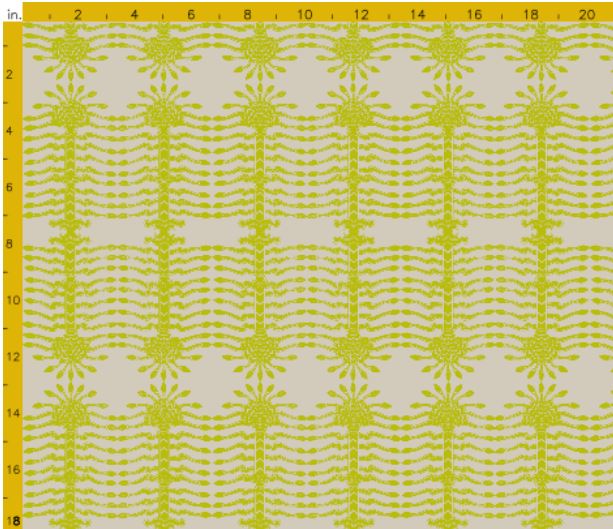 |
| Sacred tree in asparagus |
One thing about Spoonflower that I find annoying is the vast difference between the on screen colors and the actual printed colors. This example above is an asparagus green on a beige-ish background but it looks like a sickly yellow on gray on my screen. I know what the colors are because I have the color map but someone browsing the site would think it awful.

Here is an example of the difference. It seems especially problematic with blues.
 |
| sacred tree in storm |
I thought this "sacred tree" design lent itself to neutrals but I would love a few opinions on colors that you think would be great for any of my fabrics. Many are not yet for sale because it makes more sense to order the sample swatches all together, after I have sorted out the various colors. I have to proof the samples before Spoonflower will sell them.
So spill it... what other colors should I add?
Here are the designs that are public but not all are for sale.
15 comments:
Kerry, your designs are just beautiful. I can only imagine the time it must take, but how amazing and fun. How about Sacred Storm in indigo, olive green or a muddy red reminiscent of Indian block prints? Keep us posted!
Kerry this link goes to the main page of spoonflower. I like crisp white backgrounds these days. I am also leaning toward crisp clean colors. I need more green in my life. The monitor color thing is a huge problem. The three designs above are lovely, are those white accents?
I love these new designs. You are really getting a fabric line for yourself! Hope Spoonflower cooperates ! I favor the sacred tree in Navy and white or emerald and white possibly. I think a fushia and white would look good in a room with the last meander blossom. How about whole color families within certain popular designs, i.e. coordinating fabric? whoa the possibilities. Have a great day.
xo Nancy
Powellbrowerhome.com
You seem to be hitting all of the popular colors! Maybe more neutrals (or is that boring?)
Since I'm a Black and White Girl, I would like to see cw peale silloette in black.
I agree with Nancy, think having color families in your popular designs.
the pink and green is dreamy to me!
I am chiming in with the black and white ... would love to see the sacred tree really crisp in B&W. Also, love the blossom in pink and green and that would be fun for the sacred tree as well!! Bravo to color families!! xo
I love all of the fabric designs you create! I can see the Sacred Tree design in pretty much any color. I love that it could really go vertical or horizontal.
I'm too bedazzled by Meander in Pink and Green to be of any use. Gorgeous gorgeous!!
I've looked at these a dozen times and I keep changing my mind to which is my favorite print! I would love to see sacred tree in lavender, cobalt or black & white. I seriously love Meander in the 3 colorways you've shown.
www.chattafabulous.blogspot.com
Your designs are always great kerry, I would love to see some navy or purple too! Good luck!
Both these patterns are genius!! In terms of color, I"m not sure about advice. I love blue, green and yellow so I think it's great when there's options for those. Maybe a neutral too for you last pattern.
I really like the blue and white fabric...I just put together some fabrics with blue, white and a tad of yellow for a client. Her walls are yellow and she refused to paint them. I had a very hard time finding fabric with yellow in it. Good luck...your very talented.
Sorry about your frustration regarding colors being true online. I am excited about your designs! I am a gut instinct kind of person, and I am not certain I could add to anything others have written here other than go with your gut instincts, it has served you well thusfar!
Your designs are just stunning - love, love the sacred tree and selfishly would be so excited to see it in an icy blue (light aqua). Using that color in the beach house and your fabric would be fabulous!! Happy weekend ~
Post a Comment