Showing posts with label critique. Show all posts

Tuesday, June 25, 2013

2 Decorating peeves and solutions


Okay, I know its popular to put your kid's name on the wall but I don't get it. Is it supposed to promote literacy, help forgetful parents, what?
If you are reading this chances are, you don't need my help but I saw one too many stupid nurseries in Pinterest and had to vent.
Words on walls is my #1 peeve in this post and in life.
If your kitchen wall says "Eat here" what on earth does it say in your bathroom?
I am a fan of original art anywhere you have a bare wall but that is not in the budget for everyone so here are two ideas for a kid's room that I prefer.


Map are interesting and in theory you can leave it on the wall until they head off to college. Maybe they will learn something other than their name.


Chalkboard walls aren't just black anymore.
The possibilities on a chalkboard wall are limitless and its just paint.

Peeve #2
Matching sofa and loveseat


Are everyone's eyes still in place? I removed all sharp objects before writing this post so I would not be tempted to gouge my own eyes out.
If you have this situation already a) burn the rug and b) stash that loveseat elsewhere and go chair shopping.

Grab a matching pair if you must but don't forget Craigslist, Ikea, and CB2 for affordable options.


See? Nothing matches.
World keeps spinning...

Mother in law and sister in law are en route...Surprise!
I might be out for the rest of the week. As long as I don't end up twitching in a corner, life's alright.


Thursday, May 2, 2013

Genius or awful?

via
Thoughts?

I think it belongs on the pages of RH for squirrels. If Gary Friedman had conceived it I am sure that he would have an annoying deep thought about the meaning of the wood. Don't get me started...

2 points for weirdness. Feel free to disagree.

Tuesday, October 16, 2012

I was absent that day

I was dreadfully sorry that I did not post a"cool art term Monday" yesterday.
Next week, for sure.
 Truthfully, wretched Fall allergy Sunday prevented it and Monday was crazy catch up day for me.
I am just going to show you a few things that have moved me lately and humbled my sense of art knowledge. 

Joan Mitchell

I fell into the "I already know it" trap. My grandmother taught art history and my first year and a half of college was spent in that major but I had very little instruction  about the post modern movements.

Joan Mitchell

I doubt that I have anything profound to add to that discussion but to the modern art haters, I must ask does this not conjure something? Disgust? Perhaps an odd confusion? A sensory memory?


Does art like this annoy you with its simplicity or vagueness?


I have nothing against representational art, in fact, I admire a great deal of it, but it is these bits and expanses of color without form that intrigue me. I wonder, why does this remind me of the scent of lemons or fresh tires? Often I do not know where the fond association lies.


I wish that I had stayed on for the post modernist discussion in college or that I had my grandmother to mull it over with.
I challenge each reader to seek out a new bit of art that is, maybe out of your beautiful /comfort zone, and find something interesting, if not good, to associate it with and DO TELL.

Tuesday, July 17, 2012

Inspiration:photos to canvas

Luberón by Kerry Steele
This painting has been around for a month or so but I just listed it on Etsy with these inspiration photos.


Mine is an abstraction to the largest degree. I can't explain how I get from the inspiration photo to my abstract vision. I suppose I take the colors and shapes and shake gently.
Here are a few more.

These flowers are inspiration...


for this.
Arrangement in cut glass 24 x 30 acrylic on canvas by Kerry Steele
I have to say that my camera might be my undoing. I just can't seem to get clear color. Or maybe its my computer.


This photo of Senanque, in France became...

"Senanque" acrylic on canvas by Kerry Steele

 This garden's colors were the inspiration for my painting "Boxwood garden".

"Boxwood garden" acrylic on canvas by Kerry Steele

Also....sigh.. I am using this inspiration photo for a large painting but I am not liking it so far.


I am not complaining. This still never seems like work. I love to paint.
 I should share that I used to be of the thought that art, real art, should come from a deep angst or negative emotion.
I painted "there" before but have found far more success and admiration for my work in this happy place that is now.

You can check out more of my inspiration on my Pinterest board "Painting Inspiration". 


Thursday, May 31, 2012

Let's do this again


Yesterday I posted a chair and asked for your opinions. I got some great responses and to be honest I am a little overwhelmed with other tasks at the moment.
So, today I am posting an entire room that I think will generate some strong opinions.
Could you live with this room?
Visit it?
Suggest it to a client?
Or did Pucci just get done watching The Wizard of Oz?

Friday, January 13, 2012

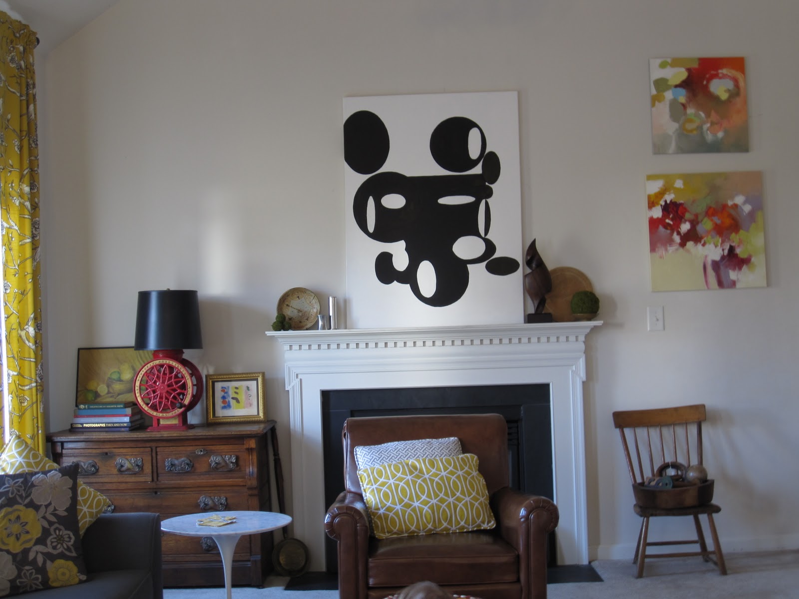
Mantel revisited

Fall 2011

I have spent the last several days playing with my stupid mantel.
If you read this post you know about the hole and the challenges the mantel presents

September 2011
The comments left were helpful and my husband and I agree that the hole has to go, but not just yet.
It will have to wait until we paint and with 18 foot ceilings, I am in no hurry.

So please be kind while laughing looking at my trial vignettes.
I was inspired by a post of Michelle's on My Notting Hill
This overloaded mantel was love at first sight. I couldn't do exactly this because of the painting and the hole but I tried a mini version.
No, I don't think so

It was too dark and moody for the room which is a mix of modern and rustic pieces. As it is, I think there is too much wood and too much brown, so Ye Olde Curiosity Shop had to go.
 I tried colorful books but the result was laughable and cluttered in appearance.
Next came a few that did not even warrant photos.
Yesterday I found the swirly wood sculpture thingy and this morning remembered a few things that were packed away. So I tried the above arrangement. At some point there was a green beaker vase but I must have forgotten to snap a photo of that abomination.

Next came the sparse look.
This was better but really too sparse.

Adding another circular element helped by repeating the circular shapes in the painting and the adjacent lamp.

This is where it stands 13 January, 2012
**In the hour since I posted this I added one small tweak. Moss covered balls for an extra layer and texture.**


I really would have preferred more color but it was not to be had in my shopping trip yesterday, which was a four hour shopping trip with a two year old.
My other thoughts were to frame the painting and possibly paint or gold leaf the swirly sculpture thingy.
Fire away with your comments!

Friday, December 16, 2011

Oh how fickle I am

I am feeling a little under the weather and I have a "to do" list a mile long. I thought I might sneakily recycle a Christmas post from my old blog, GoodtasteGoodtasting but instead I found a opinion of mine that I forgot all about.
It is about 2011 Pantone color of the year, Honeysuckle Pink.
Read this and be sure to see the last photo--funny.

Are they serious?

Pantone announced their 2011 color of the year to be Honeysuckle or in lay terms... pink.

I think it is rather odd and perhaps a bit juvenile in its feel. Personally I adore pink dresses, shoes and accessories as a part of my summer attire but not my house.

Here is how Pantone describes its applications in interiors.
" Home Interiors
Honeysuckle is upbeat and dynamic when used on large areas like the entry area of a house or an apartment. It is an appetite and conversation stimulant when used on the dining room walls. In the kitchen, it adds a fun touch on the table in placemats and other linens (patterned or solid), colored glassware, candles and small appliances. Honeysuckle is a great color to cover up shabby kitchen cabinets, or, if that’s too much of a color statement for you, try repainting knobs and drawer pulls. But be warned – once you try this arresting shade, it can become addictive."

It just feels too unsophisticated to me. Maybe for outdoor furniture or something in a cabbage rose chintz.


I just think it is limited in its appeal because it is so feminine.

Agree?

Ok, I am back in the present. Check out my first floor bathroom.
Its not the best photo, I know, but it illustrates my point--and with out a toilet!

I am in love with 2012's color. More about that in the future.

What do you think?


Don't forget to enter my giveaways HERE and HERE for these...
both end Tuesday December 20th.

Sunday, November 13, 2011

Masterpiece or messed up?

by Alejandra Zapata

I am, in general, not a fan of remakes. King Kong, Miracle on 34 the St., just to name a few.
This remake is an exception in my book.
Consider, for a moment the atmosphere in the art world in 1863 when the Salon rejected Edouard Manet's painting Le Dejeuner sur l'herbe (Luncheon on the grass).

This painting was what we would call edgy, provocative and to some offensive at the time.
The shocking nature of this work was that it followed none of the "rules" of the time. The subject of the painting was rather ambiguous. It did not seem to include a religious, historical or mythological subject. The modeling of the details was simple. This was seen as a lazy move or lack of talent. When it was exhibited in the Salon de Refuses as "Le Bain" it met mixed reviews.
One critic wrote, “Not one detail has attained its exact and final form… I see garments without feeling the anatomical structure which supports them and explains their movements… What else do I see? The artist’s lack of conviction and sincerity”
My point is that the above photograph took considerable effort to stage properly without being too literal yet still recognizable as a reconstruction. The photography skill gives it even more credence. It adds to the experience an edginess that no Manet redux would be complete without.
I think is is a very well done work of art given the skill level incorporated and the full understanding of the original. Bravo, Alejandra!
What do you think?

Tuesday, November 8, 2011

Art I am loving

I am having fun browsing Saatchi Online lately. There is a ton of fabulous art including one of my own pieces. It'll be at the bottom here.

I find this a bit haunting.
 More info HERE

Captivating. HERE

I find this one very odd yet somehow magnetic. HERE

Takes my breath away. HERE

This is all just a taste of the fabulosity at Saatchi Online. I could, and have frittered away hours taking it all in.


The critics booth is open to you.

Thursday, November 3, 2011

Design fickle

Did you ever fall head over heels for a fabric, lamp, piece of furniture for your home only to find something that you like better after you buy it?
 That has, lately, been the story of my decorating life.
For instance, the curtains in my kitchen and family room.

Chinoiserie print on linen on glass door

Family room with two yellow Robert Allen fabrics
I still like them. I had better like them for the cost prohibits just getting something new. Sometimes I wish I had chosen something more geometric but traditional too.


I second guess my choices in my own house often.
Another choice in my family room involves just being impatient.
That brown chair bugs me
The need for more seating than just a sofa was on my mind. I didn't want to fork over the cash for two Barcelona chairs and while antique shopping I bought the brown chair for $275. Hmmm. Not sure I should have done that. On the plus side, it weighs a ton and is very well made. It sat on Capitol Hill in some nameless congressman's office since the 1950's. It is rather petite and most importantly, kid-proof.
Maybe if I had waited a better option would've presented itself.

I like this one from CB2

There really are only a few things on my "regret list" but every time I look at them I think "should I have bought that?"
Do you have any home purchases that you regret?